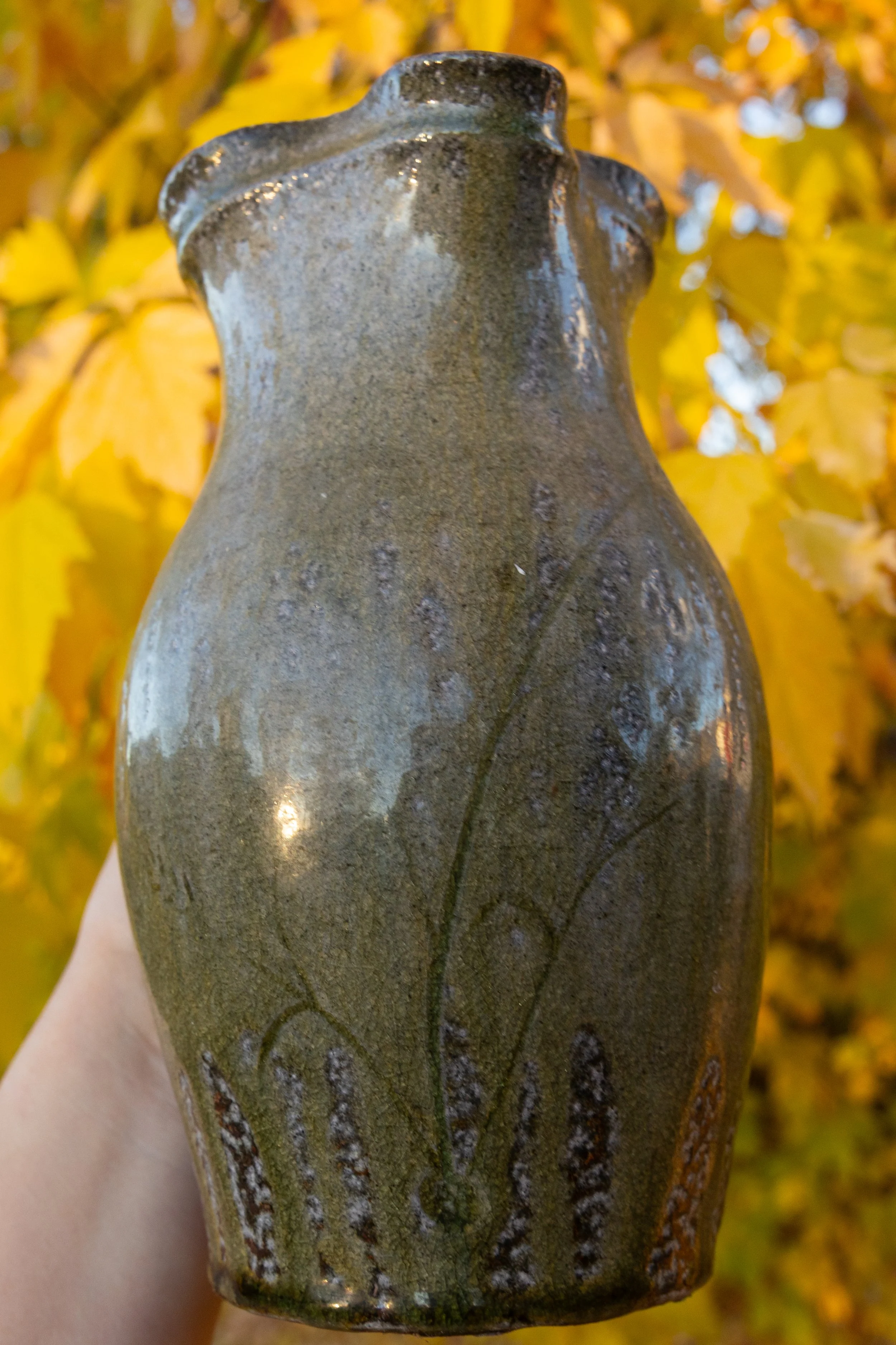
Why I Don’t Make Bright, Colorful Pottery
Bright glazes are impressive.
They catch light. They stand out across a room. They photograph beautifully. There’s a confidence in bold color — cobalt blues, saturated greens, glossy whites that almost glow.
For a while, I thought maybe that’s what I should be making.
When you’re early in clay, it’s easy to assume that louder equals better. If a glaze pops, it must be strong. If it stands out, it must be successful.
But the more I worked, the more I realized something uncomfortable.
The surfaces I admired most weren’t bright.
They were deep.
The first time I held a high-fire piece that had matured fully — iron breaking warm along an edge, subtle flashing from atmosphere, variation that only revealed itself when you turned it in your hand — it felt different.
It didn’t shout.
It settled.
That difference mattered to me more than brightness ever did.
Bright glazes often sit on the surface of a pot. They declare themselves immediately. There’s nothing wrong with that — there’s skill and chemistry and beauty there.
But I found myself drawn to something quieter.
Earth tones. Browns that shift slightly in light. Warm grays. Subtle transitions instead of sharp contrasts. Surfaces that don’t demand attention but reward it.
I think part of that comes from where I live.
Logan isn’t neon. The mountains aren’t saturated blue. The fields in late summer aren’t fluorescent. The colors here are muted. Layered. Seasonal. Honest.
When I build work in this place, it feels strange to ignore that.
There was a period where I experimented with brighter surfaces. Tested glazes outside my comfort zone. Pushed color further than I naturally would.
Some of those pieces were technically successful.
But they didn’t feel like mine.
That was the turning point.
Because making pottery isn’t just about what works — it’s about what aligns.
If I’m building toward salt fired pottery and high fire ceramics long term, brightness isn’t the goal. Heat at cone 10 deepens clay bodies. Salt firing creates variation and warmth. Atmosphere rewards restraint.
Loud color doesn’t usually survive that process.
Depth does.
When someone picks up one of my pots, I don’t want the glaze to be the first thing they notice. I want the form to feel steady. The weight to feel balanced. The surface to feel integrated rather than applied.
Color should support the experience — not overpower it.
That doesn’t mean bright pottery is wrong.
It just means it isn’t mine.
I’m more interested in surfaces that feel weathered than polished. Matured rather than coated. Quiet instead of flashy.
Because I want the work to live in someone’s home without demanding constant attention.
I want it to belong.
Trying to make work that feels grounded, not flashy.
— Adam Corbridge
See what that looks like at adamcorbridgepottery.com